New Website for FoalWatch
Updating a website not only with style, but functionality and mobility.
FoalWatch is a unique product for the equine industry. It has helped ease the minds of many horse owners to have a better estimated time of when their mares will start to deliver their foals. But with a product such as this that is referred mostly by word of mouth, it needed not only a fresh website but one that was easily accessible on mobile devices when customers were talking about it.
Wish List
BRING IT UP TO DATE!!!
The very first thing I was asked was to help take away old feeling of the website. It was defiantly stuck back in time and needed a fresh look. I was also informed a lot of the functions on the existing site were based on a template that they didn’t ever want or need.
The other three most important things were to make sure information was easily accessible, having the ability to showcase proud owners, and to highlight their video.
The Analysis
Besides the obvious dated look, let’s pull back the covers and start to break down this website.
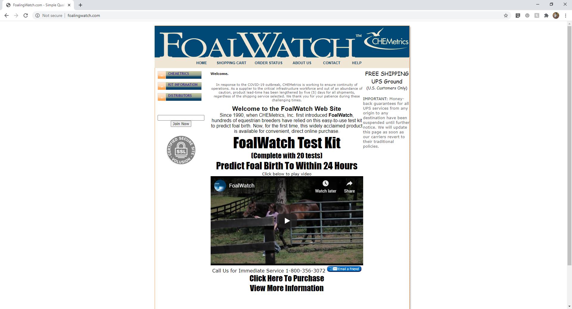
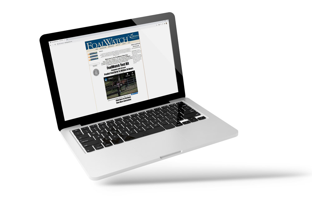
My initial impression…. this website is NOT speaking to the correct audience. It is cold, unwelcoming, and unintentionally screaming at me.
The color choice is stark. The amount of text is competing with each other and is clear that it was intended to be fixed with larger bolder font that ends up giving the wrong impression. Instead of saying “look at this information, it is important” it SCREAMS at the viewer.
No white space. Ok, I see how this can sound like I was looking at a different website as it has SO MUCH white on the website, but that is not what I am referring to. In the world of art and design, white space is what we refer to as space that is purposely left blank to give your eye a rest as well as help guide your eye throughout a piece of work.
With the correct amount of white space (or blank space as some refer to it as) you are able to section out different parts and eliminate the need to have eleven…. yes ELEVEN different font sizes that are competing.
Now, those that have been paying attention to marketing tactics may start to question white space as it would push information farther down the page. This is a great catch and YES! you want your most important information at the top of the page that #1 will engage your viewer and #2 answer the most common questions to start with. This is where someone like myself really comes into play. Not only do I focus on design, but also I listen, watch, and learn what the important items really are. As someone in the company becomes close to a product, ALL information is important to them. The most important thing I bring to the table is to find out what is the most important information for the VIEWER that is coming to the website. I am able to sit back and edit, make sure the information that is presented at the very first seconds of the website loading is not only going to catch the attention of the viewer, but keep them engaged in order for them to take that next to step in clicking on another page or scrolling down.
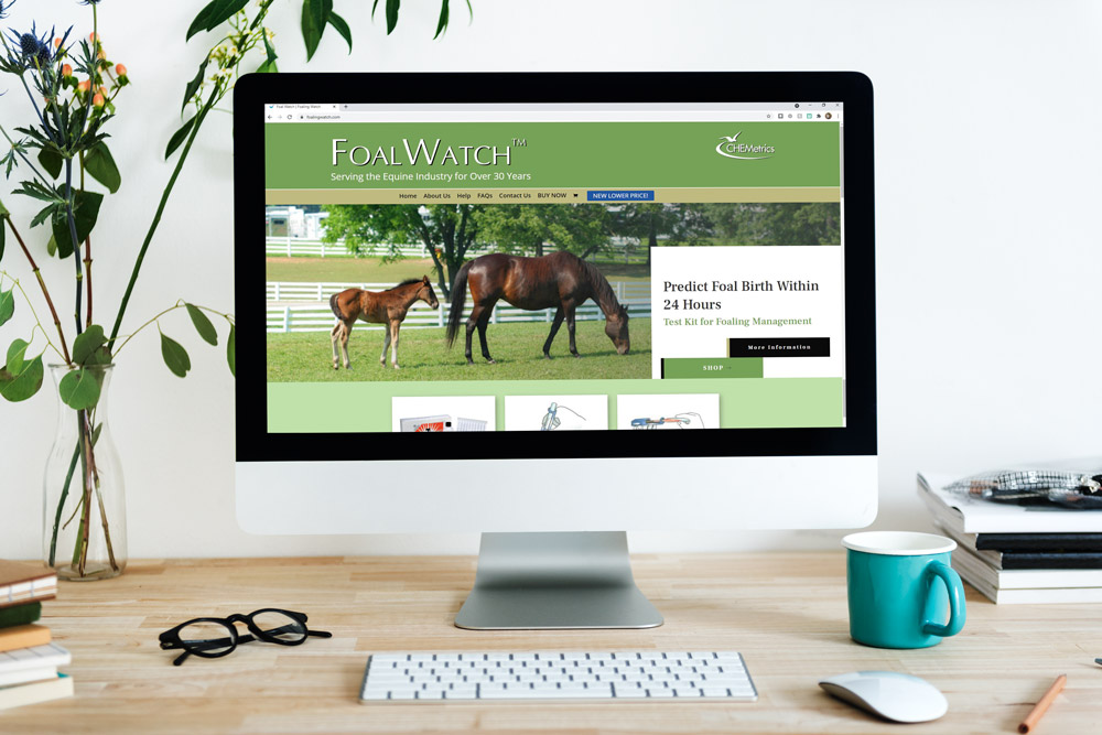
New Design
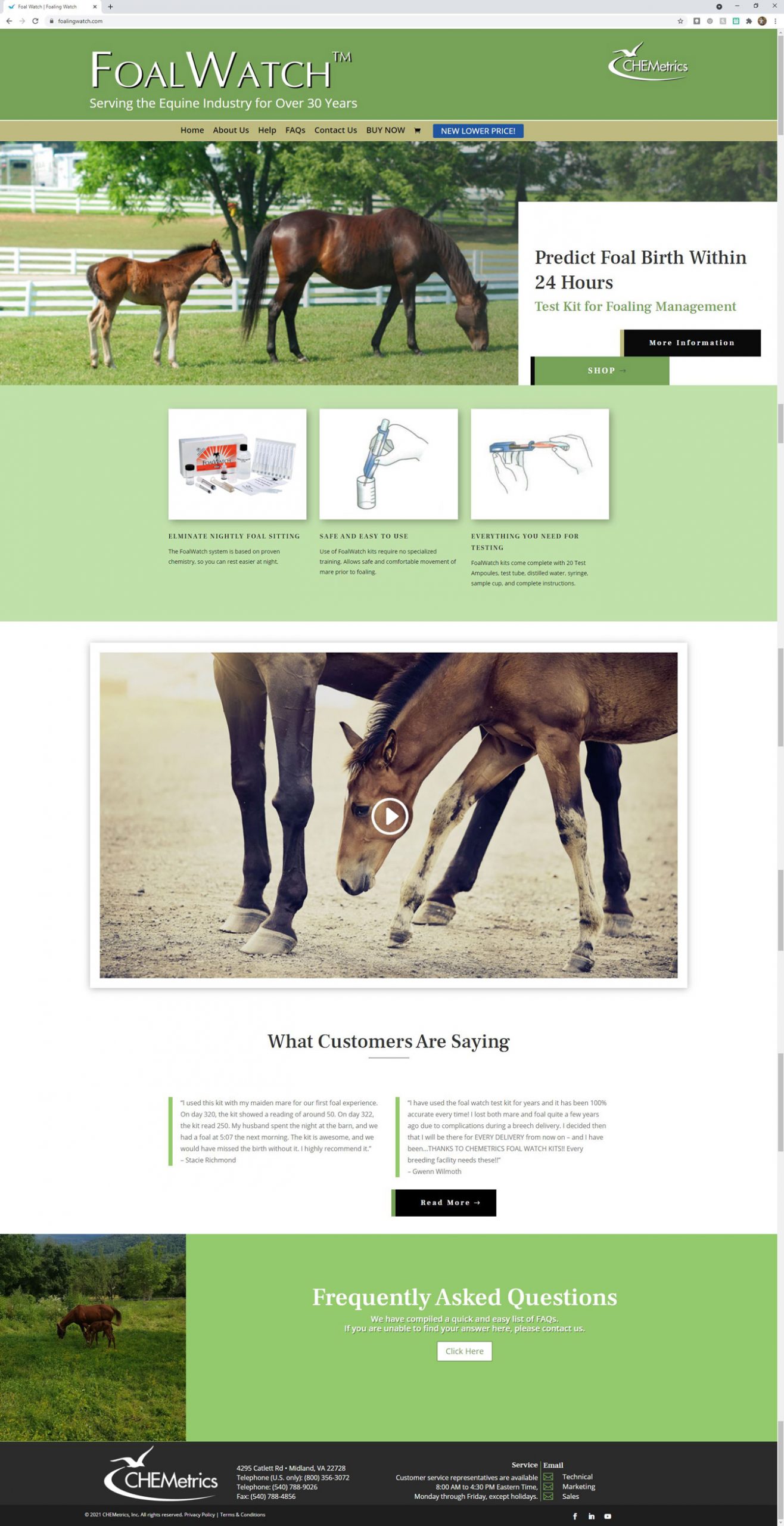
Color Choice
As I stated previously, the old website was very stark and not welcoming. I learned most of the demographic that used FoalWatch were women, but they also had men who purchased as well. With that in mind, I wanted to introduce earth tons that would be calming and yet not too feminine.
Placement of Information
The TRUE key features that needed to be seen at first were:
- Name of product
- Warming photo of mare and foal
- What the product does
- Trusted longevity of the product
- Access to purchase right away
- Access for detailed information
As you can see, I was able to lay it all out with utilizing the space and not having different features fight for attention.
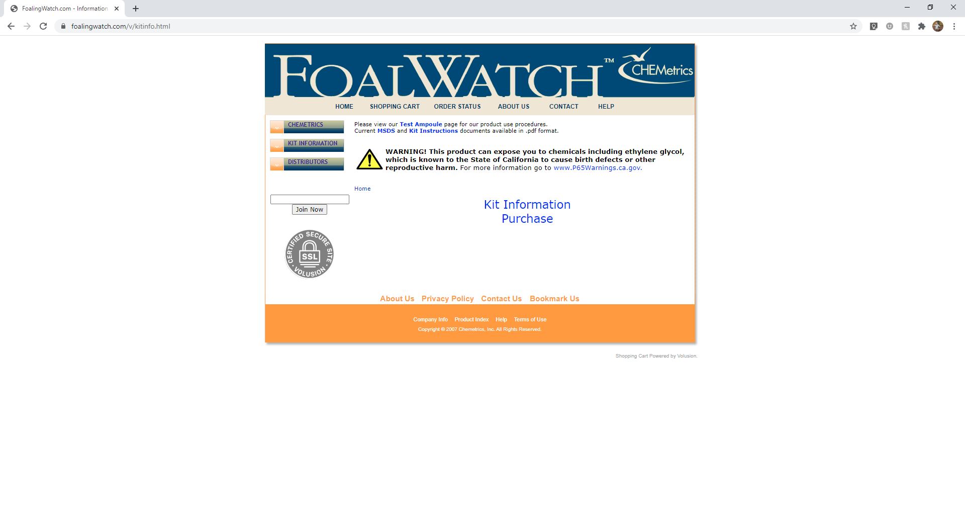
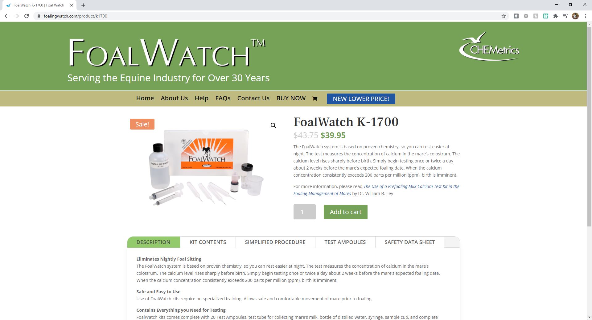
Another issue I recognized with the old website it the difficulty of finding the information about the kit. You had to click on a couple different pages to find out what the kit was, what was in the kit, how to use it, and safety. I knew right away all the information needed to be placed on the same page, with clear sections and easy access. This is why I created a table at the bottom of the kit page. All information is easily accessible and after the viewer has read everything they can add the item to their cart from the same page. (See below the Before and After images of the Kit Information page.)
CHEMetrics has received tons of compliments on their new website and I couldn’t be more proud to have brought their website up to date.
Before Kit Information Page Layout
After
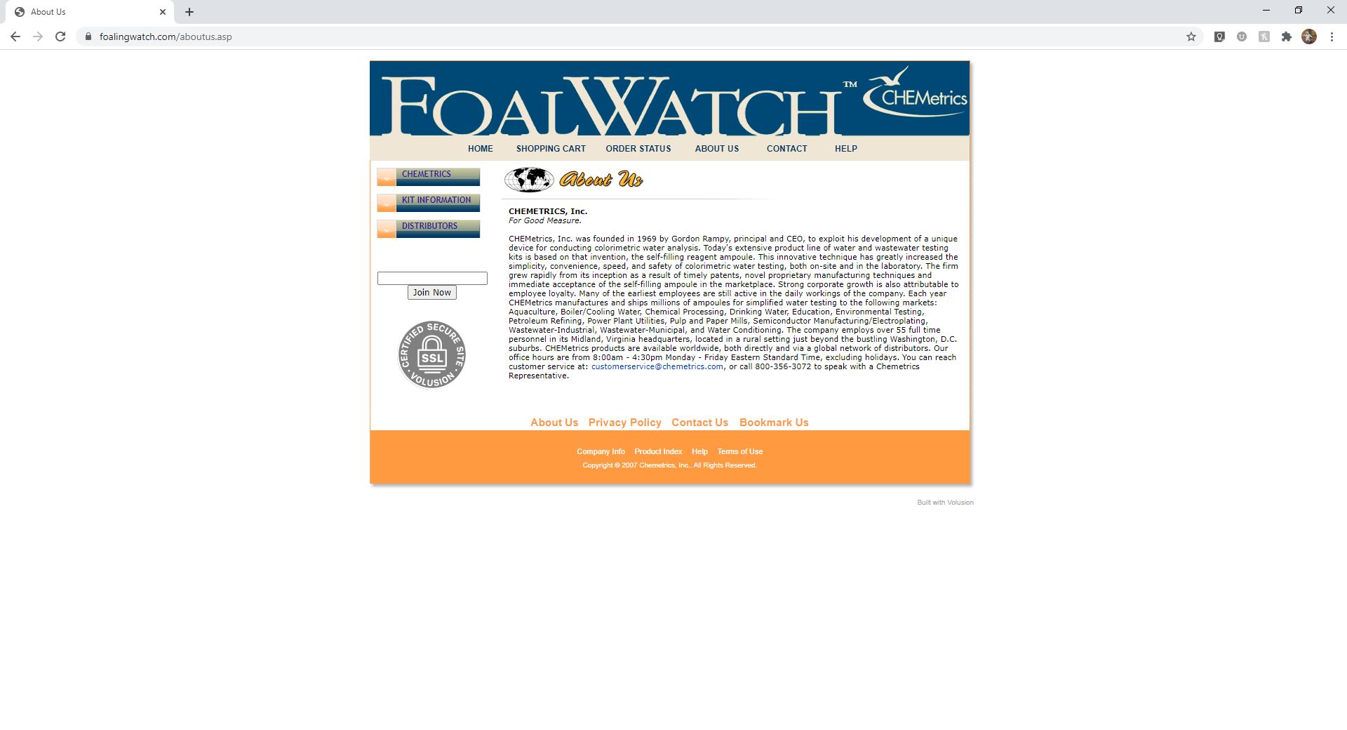
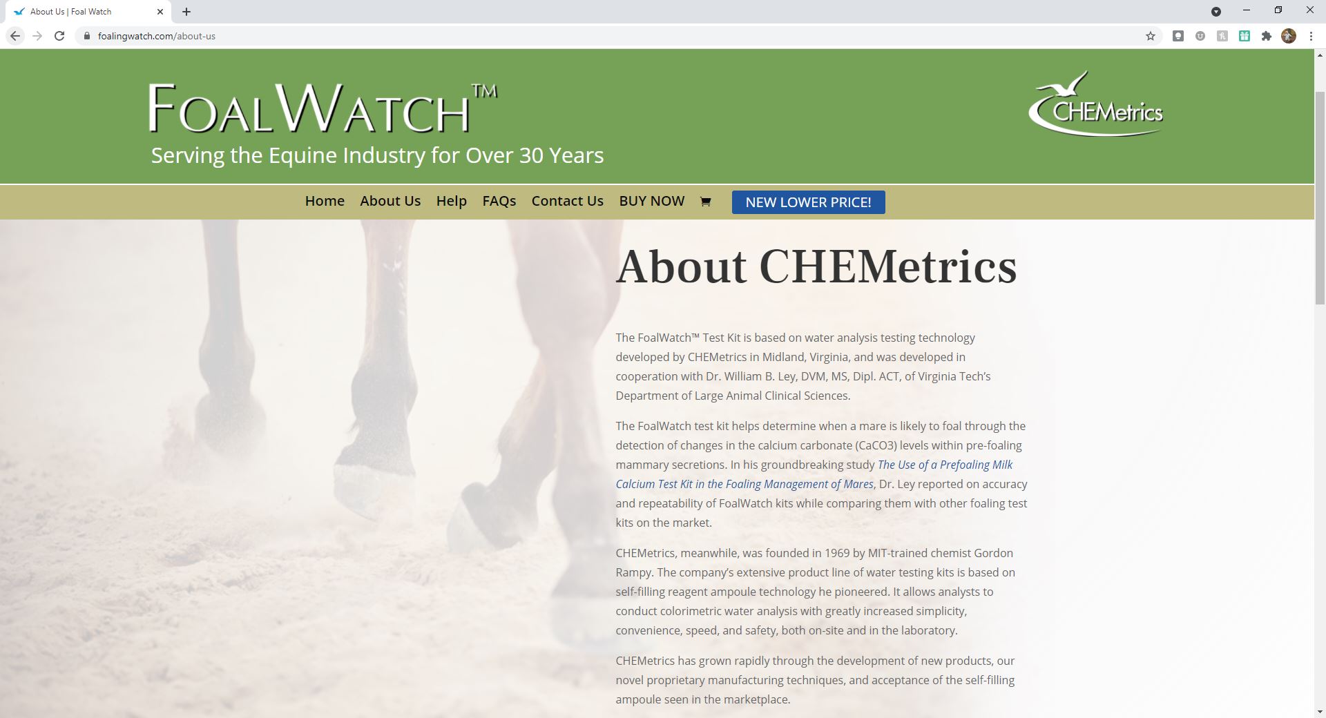
Before About Us Page Layout
After
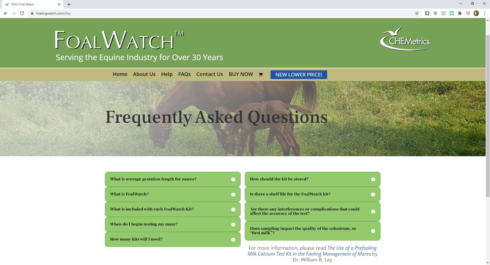
Before Help/FAQ Page Layout
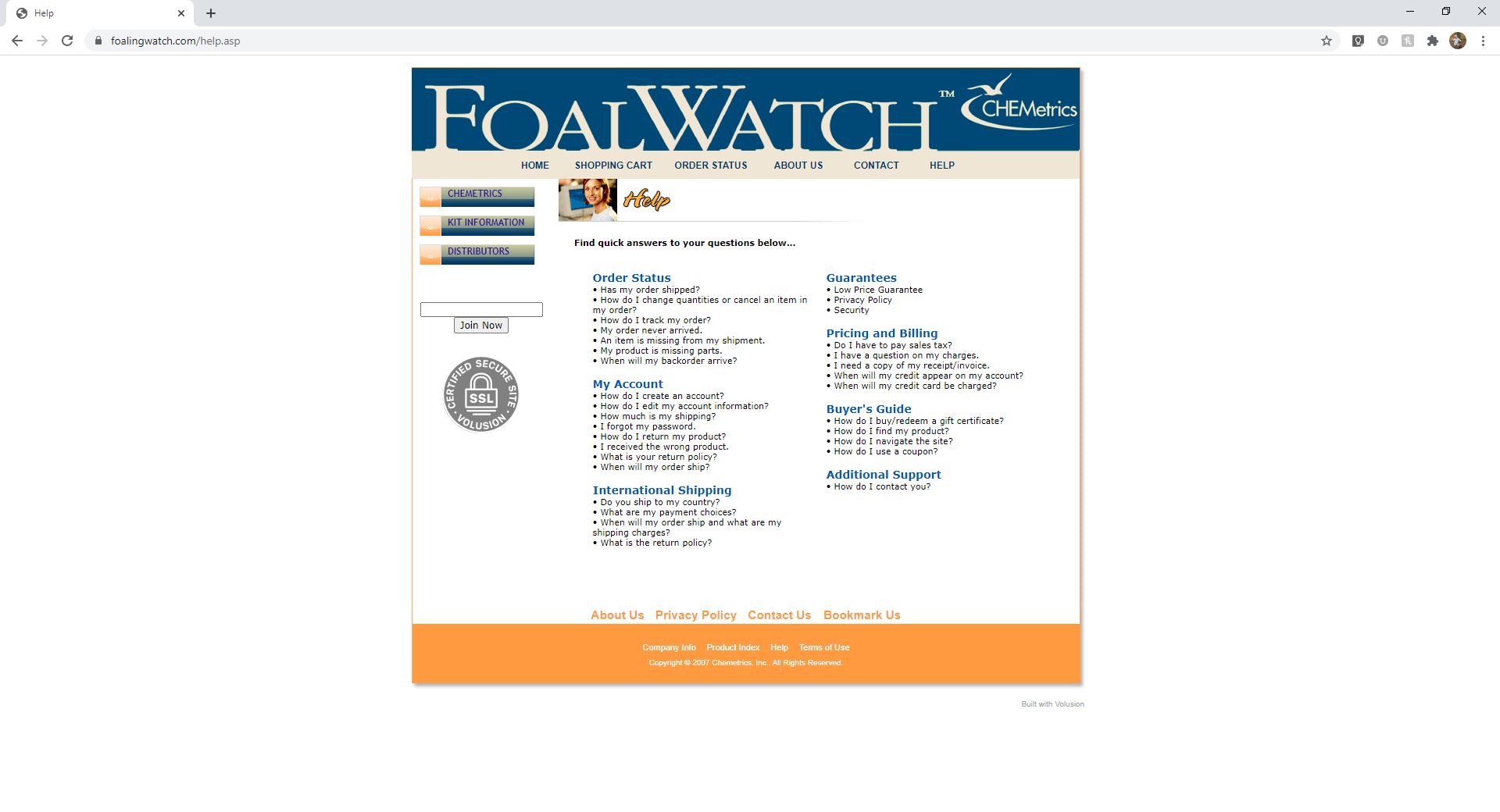
After
Before Purchase Page Layout
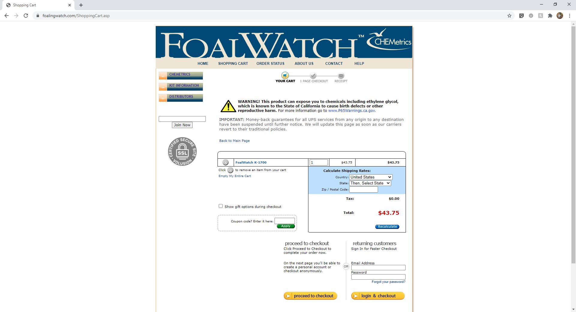
After
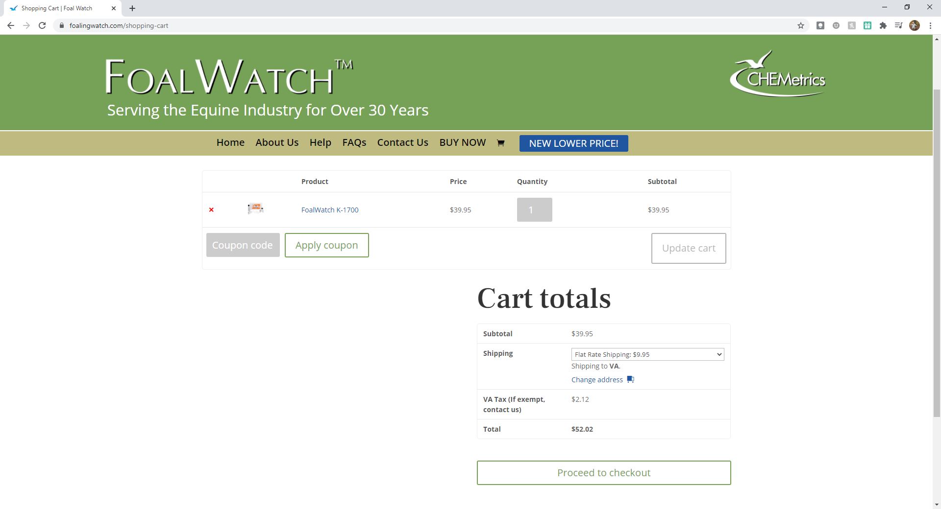
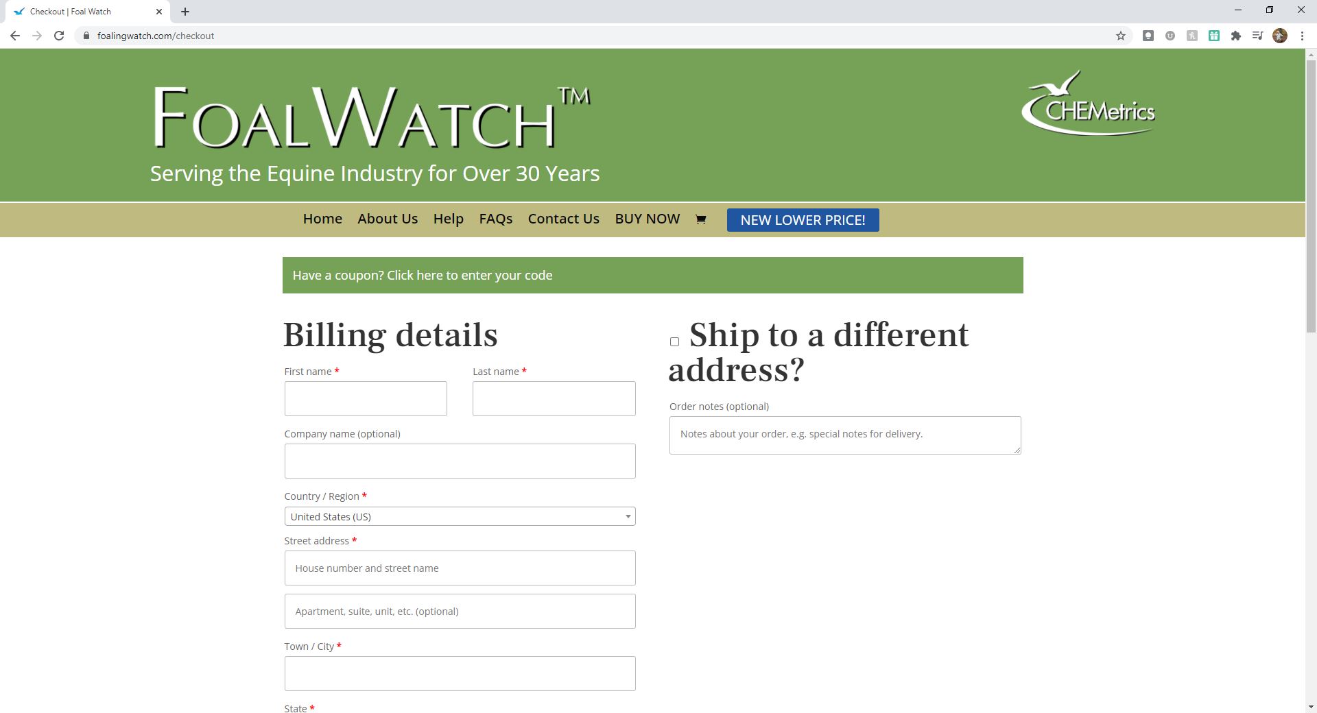
Before Checkout Page Layout
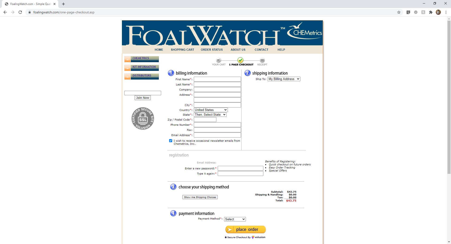
After
